What to Do With a Slow Boring Market? By Van Tharp Trading Institute
The S&P 500 has closed within 5% of its record high for 119 trading days. That’s the sixth-longest streak since 1998, and it ranks up there with the “boring” periods of the last cycle (2013, 2014, 2017). – Callie Cox via Twitter
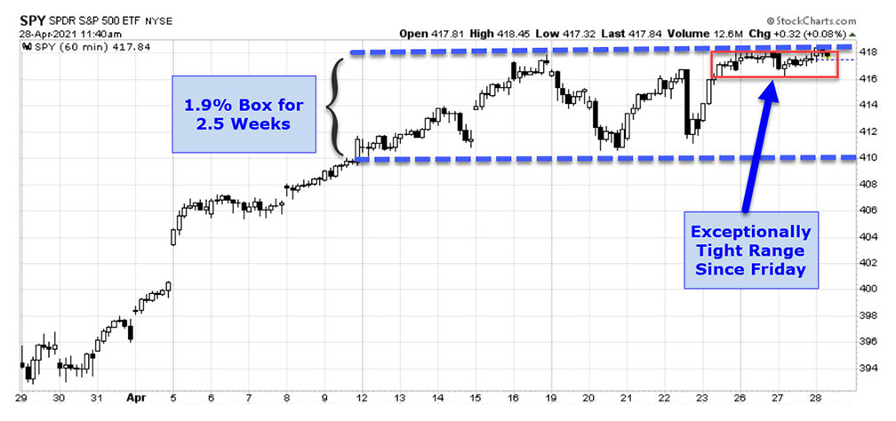
Callie Cox’s post is telling – we have spent many months at the top of the chart yet gained very little ground overall. After a moderate jump up over the last month, the last two and a half weeks have seen equity markets stuck in a range (blue hashes below) of less than 2%. And since last Friday morning, the range has become even quieter and tighter as shown in the small red rectangle –
Such is the paradox of a grinding bull market—not much movement, but almost all of it on the upside.
“How long can this last?” I have been hearing that question a lot recently – because traders get bored easily. If history is any guide, the Callie Cox quote informs us how long this might go on. Grinding bull markets can last a long time – and much longer than all of the fidgety traders would prefer.
After the markets have been pushing the top of the page for a while and traders start to question the slow-motion rally, I fall back on one primary tool to see if any yellow or red flags are flying at the top: market breadth.
Market breadth tells us how many stocks are participating in the rally. We looked at a breadth chart one month ago and since then, the charts have provided a confirming trend for the rally continuing.
Cumulative Advance-Decline Chart
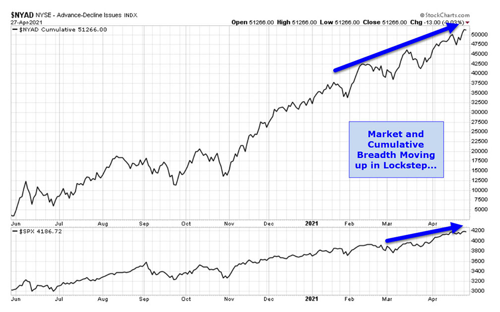
Each day, the NYSE reports an “advance-decline” number, which is simply the number of stocks that closed higher today than yesterday minus the number of stocks that closed lower. This number is called the market “breadth.” If you add all of those sequential individual breadths or advance-decline numbers together, you get a cumulative number.
The simple premise for the chart is that when the market is making new highs AND the cumulative A/D line is also making new highs, there is little danger of a massive selloff. Those are the kind of lines in the chart we have today:
Percent of Stocks above 200 Day MA Chart
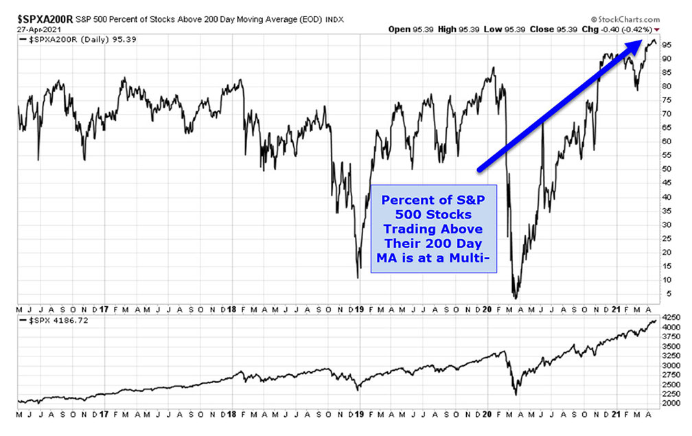
Another view of market breadth is to measure how many S&P 500 stocks are sitting above their long-term (200 days) moving averages. You can see what that chart looks like today –
This chart looks very healthy right now as well.
Bottom Line
Do these charts mean we’re heading straight up? Of course not. But the probabilities that this market can keep heading higher are certainly in the favor of the bulls.
Van Tharp Trading Institute Peak Performance Course for Investors and Traders
Van Tharp Trading Institute June 09 Peak Performance 101 Streaming Workshop


